posted November 16, 2009

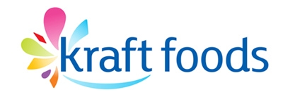
Given that I share a name with those beloved purveyors of Macaroni and Cheese Dinner, I was recently surprised to learn that Kraft Foods has launched a new corporate brand. Apparently they are keeping the old-school blue and red logo for certain products (like Mac & Cheese), as a sub-brand, but the company as a whole now has a “modern” logo… modern, in this case, meaning:
- a lowercase name
- bright, almost neon colors
- a swooshy smile
- abstract shapes representing their various sub-brands of products
Its not a terrible logo, but it sure doesn’t strike me as being worth the time and money that reportedly went into its development. One blog suggested the first draft of the logo looked alarmingly like the Yoplait brand… so much so that Kraft probably had to rearrange some of the elements to avoid legal troubles. Of course, there’s also the fact that the “smile” is way too similar to the Amazon.com logo, and that the abstract shapes remind me quite a bit of the new Giant grocery store logo.
Bottom line here is, sure, the old logo may have seemed a bit dated, or perhaps wasn’t hip enough, but it had (has) strong marketplace recognition, and it doesn’t remind you of anything other than the company it represents.
This seems to be one more identity that was cooked up by either a) a design firm that didn’t do enough marketplace research to come up with something truly meaningful and that didn’t smack of copy-cat-ism, or b) waaaay too many committees and/or focus groups. It reminds me of the update to the old UPS logo… new and shiny, but without the same substance or meaning held by its predecessor.